January 2020 — The past ten years were the warmest in modern times. Regardless of the politics going on today FMs can expect to be asked to explain how the current energy consumption or footprint of your facility compares with others. Sometimes it is just an offhand comment by the CEO or Board member, “How green are our facilities?” Sometimes those questions can result in a major study, and when the results are developed, no one even remembers asking the question. But there is an easy way to answer this question by comparing your energy utilization footprint with that of your peer group.
By comparing with a good peer group, you will be able to see if you’re doing just fine or, if maybe you need to invest in some energy savings projects to reduce consumption. Direct comparisons with a valid peer group would be very valuable and appropriate in making the correct decisions.
Many organizations are looking for benchmarking data to compare how their organization is managing its energy consumption. What is really needed is a graph showing the key utility consumption metrics of a good peer group to compare with their performance. There are tools available to answer these questions. Let’s look at some of the options.
Let’s start with the Key Performance Indicators (KPIs) for energy utilization. In North America energy intensity is compared on a gross square foot basis. Since, for most buildings, the electricity usage is a major component, we usually look at electric energy intensity: KWH (Kilo-watt Hours) per Gross Square Foot (GSF). If you are someplace other than North America, you would normally look at the same data but in square meters: KWH per Gross Square Meter. But what is a good intensity rate? If you are purchasing a water heater you can compare labels and see projected energy usage e.g. 650 KWH per year or 800 KWH per year. From that information you can make intelligent purchasing decisions for a water heater. Buildings can be compared in a similar manner; you just need to know how to develop the label that shows annual kilowatt hours (KWH)/area.
Comparing your energy consumption may give you the wrong perspective on your performance unless the comparisons are made with a relevant peer group.
FM BENCHMARKING Query Edition can be used to create a chart showing the KWH/area of a good peer group. Figure 1 is an example of a chart showing the KWH/area for office facilities.
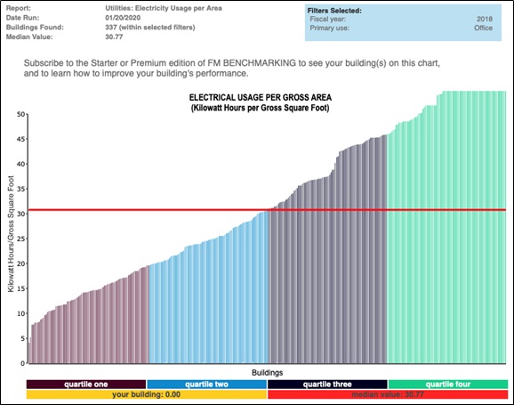
Figure 1 – KWH usage per GSF
Filters: Type of facility (Office)
Provided courtesy of FM BENCHMARKING
This allows you to see at a glance how well your facilities are utilizing electricity compared to other office buildings. There are 337 buildings in this peer group with a median KWH utilization of 30.77 KWH/GSF and a first quartile performance of 19.61 KWH/GSF. By looking at and comparing similar types of facilities, you will be able to make intelligent “data driven” decisions. The FM, for this example, has totaled his annual KWH consumption and divided by the GSF to determine the annual usage of 37.1 KWH/GSF, which is near the middle of the third quartile.
Suppose there is a significant corporate initiative to show that company is doing everything it can to reduce its carbon footprint. The CEO wants to know what could be done to achieve first quartile performance. Since our facility is located in a cold climate, it would be critical to know what is 1st quartile performance with that criteria, as we believe that the climate will have a major impact on energy consumption. That’s easy to do, so we turn on the “Climate Type” filter and see the results in Figure 2.
There are 61 buildings in this sample, so it is enough for a valid comparison (there should always be a minimum of 25 buildings for a valid comparison).

Figure 2 – KWH usage per GSF
Provided courtesy of FM BENCHMARKING
Filters: Type of facility (Office), Geographic Location (Cold)
The above chart shows a median that is much higher for all office buildings, 41.33 KWH/GSF compared with 31.77 KWH/GSF for office buildings in all climates. From this data it appears that cold climates will have a significant impact on electric consumption and our performance compared with this peer group is in the second quartile. However, if the company has a major initiative to become even greener than the second quartile, first quartile performance with this peer group must be the objective. This would result in an energy consumption of about 24 KWH/GSF or less.
FM BENCHMARKING Query is a good tool to see where you stand in a very quick and easy manner. If your facility performance is in the third or fourth quartile you may need to investigate and benchmark further to determine the next steps to take. FM BENCHMARKING’s Starter Edition is designed to benchmark Best Practices, which will help you improve your building’s performance—it does this by showing your which best practices are being employed by those in the first quartile that you are not following in your building. To see examples of how Best Practices can be applied through benchmarking, see the next article on FMLink.