February 2016 — Benchmarking your energy utilization should be a relatively easy task for any facility manager. After all, energy is one of the few factors that can be directly compared across any organization without regard to cost or level of service. In most of the world it’s measured in KWH (kilowatt hours), or in BTUs (British thermal units) in North America. It’s easy to convert from one to the other and since for most organizations electricity is the largest component we’ve been using KWH per gross square foot as the normalizing metric.
Although climate change issues have been politicized, it is increasingly apparent that the earth’s climate is changing and many facility managers and real estate executives are being questioned about their facilities’ energy footprints. This often can take the form of an offhand comment by the CEO or Board member; e.g., “How green are our facilities?” There is an easy way to answer this question by comparing your energy utilization (footprint) with that of your peer group.
Benchmarking with a good peer group will tell you if your facility is performing well or if it requires additional investments in energy savings projects to reduce consumption. Direct comparisons with a valid peer group would be very valuable and appropriate in making the correct decisions and answering the question about how you your facility is doing.
So, what are the typical problems with answering this question? A common issue for many is having enough time to collect and input data for a benchmarking survey. What is really needed is a table or chart showing the key utility cost or consumption metrics of a good peer group to compare with their performance. Another issue is that sometimes the data is not readily available. In this case all that’s really needed is a years worth of energy bills showing the total energy consumption and the gross square area of the facility. Assuming your energy bills are all in one place, this should be a fairly easy task.
In North America energy intensity is compared on a gross square foot basis. Since, for most buildings, the electricity usage is a major component, we usually look at electric energy intensity: KWH per Gross Square Foot. If you are someplace other than the North America you would normally look at the same data but in square meters: KWH per Gross Square Meter. But what is a good energy intensity rate? Comparing your energy consumption may give you the wrong perspective on your performance unless the comparisons are made with a relevant peer group.
The solution is to use a benchmarking tool to create a chart showing the KWH/area of a good peer group. Figure 1, for example, is a chart showing the KWH/area for office facilities.
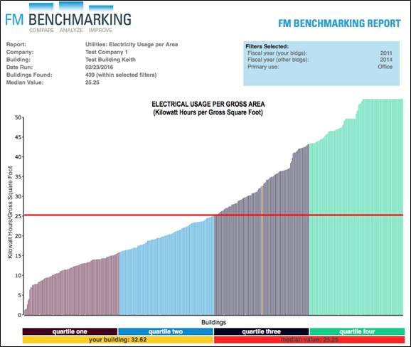
Figure 1 – KWH usage per GSF
Filters: Type of facility (Office)
Provided courtesy of FM BENCHMARKING
This allows you to see at a glance how well your facilities are utilizing electricity compared to other office buildings. There are 439 buildings in this peer group with a median KWH utilization of 25.25 KWH/GSF and a first quartile performance of 15.8 KWH/GSF. Our building’s performance is not so good at 32.6 KWH/GSF and is shown in yellow in the third quartile. By looking at, and comparing similar types of facilities, you will be able to make intelligent “data driven” decisions.
Our building operates for 15 shifts per week, quite a few hours. Let’s see what happens to the peer group if we add in a filter for those operating more than 8 shifts per week.

Figure 2 – KWH usage per GSF Provided courtesy of FM BENCHMARKING
Filters: Type of facility (Office), Shifts per week > 8
The median for this peer group moved up about 5 KWH/GSF to 30.49 KWH/GSF. While it seems intuitive that buildings operating longer hours should consume more energy this analysis is objective not subjective. Since the median moved higher, our building is now closer to the second performance quartile (it appears to have moved to the right, even though is it still using the same consumption). Clearly, our peer group is now a much better match.
Let’s add in one more filter to see if we can refine our peer group even further. Our facility is located in a hot-dry climate and buildings in that climate zone typically consume more energy. We will leave all the other filters in place too so we can compare in Figure 2:
- Only office buildings PLUS
- Operating more than 8 shifts per week PLUS
- In a hot-dry climate zone
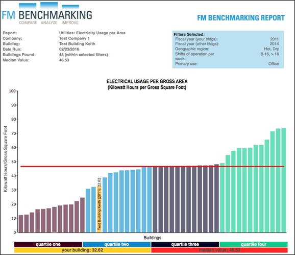
Figure 3 – KWH usage per GSF
Filters: Type of facility (Office), Shifts per week > 8, hot-dry climate zone
Provided courtesy of FM BENCHMARKING
In this peer group the median value goes up to 46.5 KWH per GSF and puts our facility’s performance in the second quartile… almost to the first quartile.
It would have been a big mistake to base our energy initiatives on the first chart that was developed. However, reaching first quartile performance based on the peer group in Figure 3 should be readily achievable. This really shows the value of filters and the reason to develop a good peer group for benchmarking comparisons.