April 2019 — Utility costs are usually either the first or second cost component for most FMs; maintenance costs are the other. If you haven’t been asked to look at utility cost reduction options, you probably will be soon. It is such a large component, usually around 35% of operating costs that many FMs are continuously looking for options that would improve the efficiency of their facilities.
You may have been asked to evaluate options to reduce costs, but how do you do this without measuring the costs and then comparing them to those of other similar buildings. This is where benchmarking can help. If you have participated in a benchmarking program, you may have found it difficult to make good comparisons unless your building is very simple. For example, hours of operation, occupancy density, age of mechanical systems, climate, size of the building, and many other factors can have a significant impact on utility costs. Having access to ample data with good filter sets is key to making the right comparisons. Here are a few examples to show the value that filters can add to the analysis of your benchmarking data.
Let us assume our subject building is an office facility, so it would make most sense to compare only with other office facilities. In Figure 1, there are 344 office buildings; their median utility cost (horizontal red line) is $3.82 per GSF (gross square foot). Our building’s utility cost is shown in yellow, near the middle of the third quartile, at $4.55 per GSF.

Figure 1 – Utility Cost per GSF
Filters: Type of facility: Office
Provided courtesy of FM BENCHMARKING
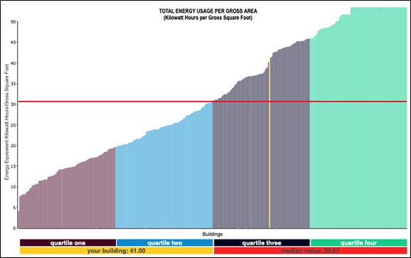
Now, the third quartile isn’t a great position to be in, but perhaps our facility is in a high cost utility area. Let’s check that by benchmarking utility consumption instead of costs. In Figure 2, there are the same 344 office buildings and our consumption is in about the same position as our costs. The median consumption is 30.67 KWH/GSF and our building consumes 41.00 KWH/GSF annually.

Figure 2 – Utility Consumption per GSF
Filters: Type of facility: Office
Provided courtesy of FM BENCHMARKING
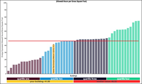
Let’s stay with the consumption metrics and see if some additional filters can help explain our relatively high costs. Our facility is in a hot-dry climate zone so much of the utility consumption would be used to cool the building. Let’s add that filter and see if the consumption profile of our peer group changes (see Figure 3).

Figure 3 – Utility Consumption per GSF
Filters: Type of facility: Office; Climate: Hot-dry
Provided courtesy of FM BENCHMARKING
By applying this filter our facility, compared with our peer group, is now in the mid-range of the second quartile—this happened because all the buildings that were not in a hot-dry climate dropped out of the comparison, and most of those buildings were outperforming our building; so although our building’s consumption remained the same, it has moved into the second quartile. So our building’s performance isn’t so poor after all.
We have learned something by applying different filters that may affect management focus:
- If we just compare our costs with those of other office facilities our costs and consumption are near the middle of the third quartile, which is not a good position.
- Just comparing with office facilities doesn’t provide the whole story. Our facility is in a hot-dry climate zone so we need to compare with other office facilities in the same climate zone to get a true picture of our performance.
- There is still room for improvement so we should examine the utility functions and determine what is contributing to the higher cost profile. We can do this by applying other filters (e.g., building age) and see if any have a major impact on our building’s placement.
Only after we define the right filters can we proceed to determine if there is anything else we can do to improve our building’s performance within our peer group.